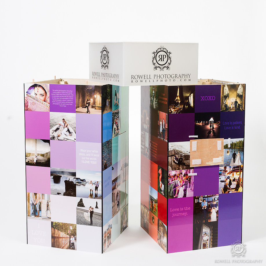
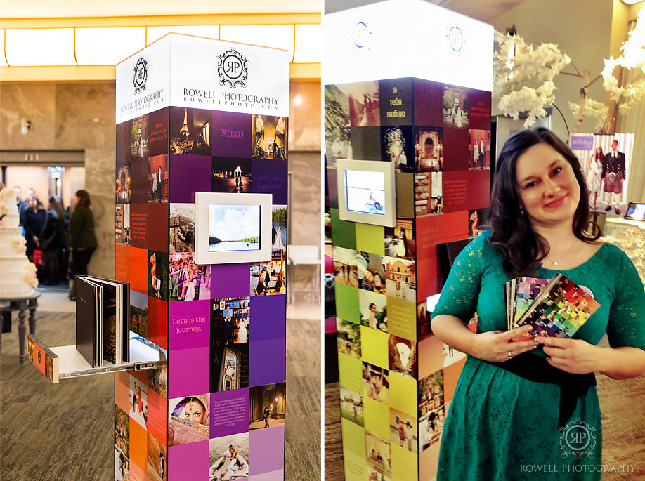
Earlier this month we participated in the Wedding Co. Trade show to meet some newly engaged couples at The Carlu in Toronto. Its not too often that we will participate in a trade show so we wanted to do something fun and creative. We needed to show off our diverse portfolio, our message and do it all in a way that would get us noticed. Instead of purchasing the biggest booth we could, we opted to get them smallest one the show had to offer which would force us to get extra creative in such a small space. We had 18 inches around to work with and not further than 6 feet tall. We wanted to be able to set up in minutes and more importantly take down in less. So we created our little rainbow booth, that showcases some of our most favorite photos, our most unique weddings and engagements. The design for the booth images, and structure was created by Ryan and I, and we used a piece of software called SketchUp to refine our idea.
We are so lucky to have so many amazing friends, and we really wanted to thank Luca (One of our company photographers) and owner of PicFoundry, who did all the printing for the panels of the booth, and also provided Ryan with the tools and garage to create the album drawer and the secret trap door in. Also Steve and Liz Johnston of Eventdecorator.com who did all the wood cutting for us. Truly the best friends we could ever ask for!
Thank you to everyone who helped build, assemble, print, inspire and to all who visited our booth at the show, it was an absolute pleasure.
& Ryan
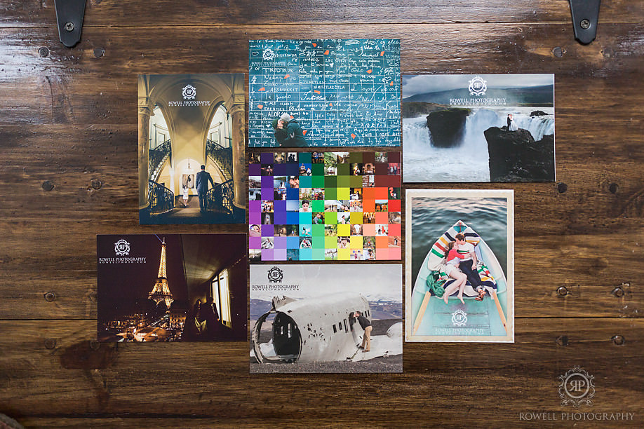
We wanted to create a number of promotional materials for couples to choose from. Giving them the chance to pick a postcard they liked, and therefore sending the message that we can cater to their individual unique personalities and style.
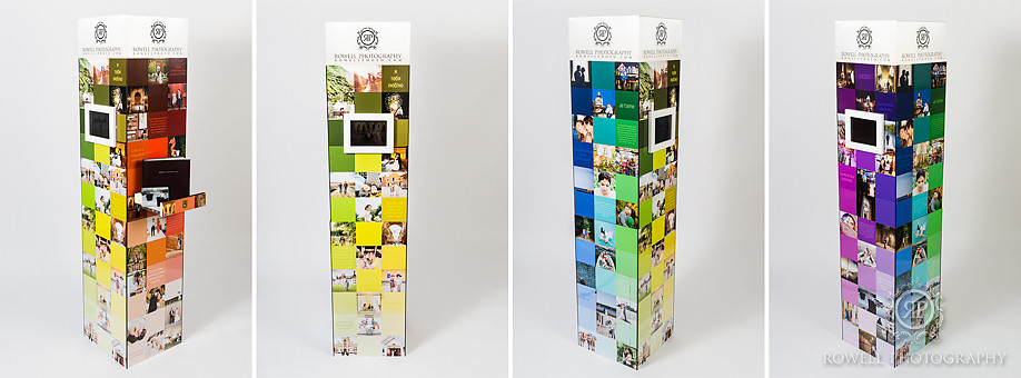
Our booth was 18 inches wide on each side and just under 6 feet tall. Each side with photos that blended to the corresponding color we chose, and faded from darker, bolder colours and images to lighter, softer tones.
Our favorite addition to the booth was a small drawer, big enough for a 10×10 inch wedding album. When couples lined up to see the albums they would simply slide out the drawer, and lay the book completely flat at the perfect viewing level. While one couple would look at the albums, other couples would be looking at images on the iPad. The iPad’s on adjacent sides allowed for couples to swipe through images at their leisure. We prepared a gallery of images for each location we have photographed at in the last 2 years in the hopes that couples at the show would be looking to see images from their own wedding venues. There were 60 galleries to choose from.
We created a secret trap door on one side of the booth for us to keep all our promotional materials in and also the battery we powered the iPads from.
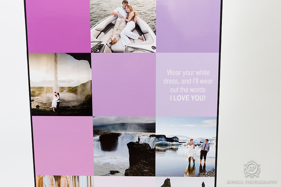
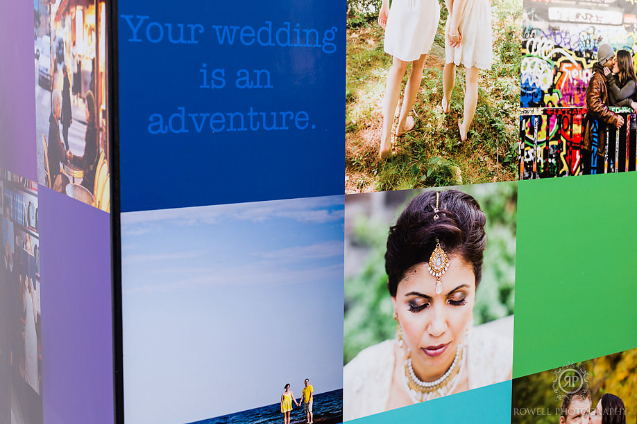
We chose to use some of the coloured squares to further our branding messages, testimonials from past couples, and quotes the represent the overal feeling of our photos and our style as a photography company.
More than anything, we wanted this mini booth to pack down fast. It takes us 10 minutes to pack the entire thing!
The top of our booth is a functioning light! We wanted our logo to be shining throughout the show. Ryan used a strip of LED lights along the inside of the booth, and then created an acrylic box for the top. We had our logo printed on clear vinyl by UCA Branding.
Each panel packs down flat, and the album drawer comes out. We strapped on some simple wheels, and bubble wrapped the printed sides of the panels to protect them as well dragged the booth to our car.
Our design in SketchUp diagram.


